Plotting
Overview
Plotting functions allow you to visually explore the images and deployment files specific images from a Wildlife Insights dataset.
Here is a quick overview of the different plotting functions and their description:
| Function | Description |
|---|---|
plot_activity_hours |
Plots the activity hours of one or multiple taxa by grouping all observations into a 24-hour range. |
plot_date_ranges |
Plots deployment date ranges. |
plot_detection_history |
Plots detection history matrix for a given species. |
For every snippet of code showed here, we will assume you have already run the following code:
import wiutils

cameras, deployments, images, projects = wiutils.load_demo("cajambre")
Plotting date ranges
Following the explanation on date ranges in the extraction section, the plot_date_ranges function allows you to visualize these ranges. Its usage is very similar to the get_date_ranges function (in fact it is used under the hood).
You can plot the date ranges based on the images (i.e. dates of the first and last images taken in each deployment):
>>> wiutils.plot_date_ranges(images=images, source="images")

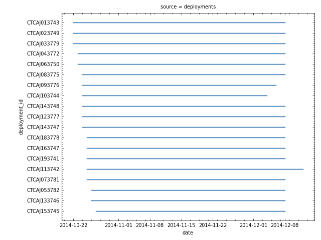
Or you can plot the date ranges based on the deployments (i.e. start and end dates of each deployment):
>>> wiutils.plot_date_ranges(deployments=deployments, source="deployments")
You can also plot both to compare them:
>>> wiutils.plot_date_ranges(images, deployments, source="both")

As you can see, all the date ranges except for one are identical. The CTCAJ143747 deployment has no date range when computing the ranges based on the images because it only has images for one day over the whole period.
Plotting activity hours
Because each image has an associated time, it is possible to explore the circadian activity of a specific species (or taxon). The plot_activity_functions offers multiple ways visualizing this activity for one or more species.
Note
For the activity hour plots, observations (i.e. the sum of the number_of_objects field in the images dataframe) are grouped into 24 one-hour bins.
The kind parameter lets you specify one of the following type of plots:
"kde": Kernel Density Estimate (only works whenpolar=False)."hist": Histogram (works for bothpolar=Falseandpolar=True)."area": Area chart (only works whenpolar=True).
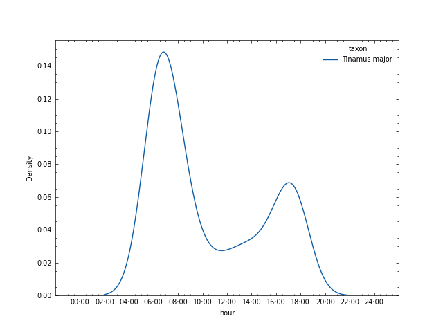
Here is an example of a kde plot for one species:
>>> wiutils.plot_activity_hours(images, names="Tinamus major", kind="kde")
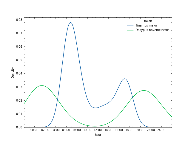
You can also pass more than one species by passing a list of names (note that they have to be present in the images dataframe) to the names parameter:
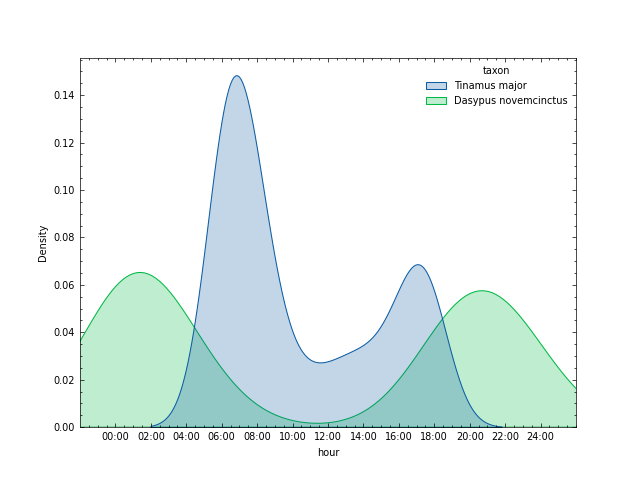
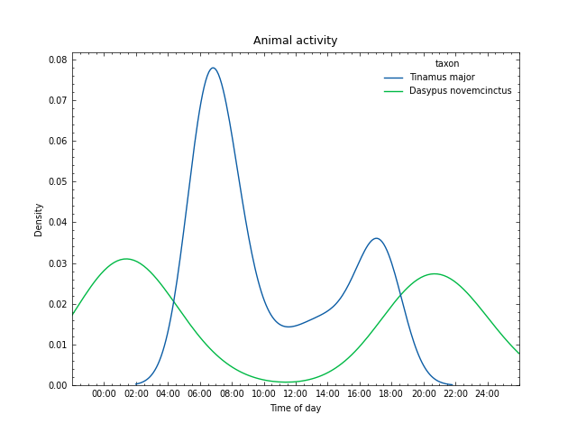
>>> wiutils.plot_activity_hours(images, names=["Tinamus major", "Dasypus novemcinctus"], kind="kde")
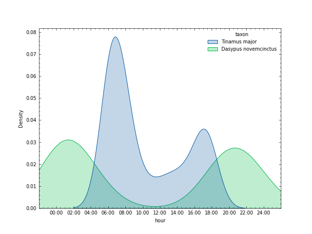
The KDE plot is based on the seaborn.kdeplot function, so you can pass any keyword argument used by that function using the kde_kws parameter. For example, you can fill the area under the line:
>>> wiutils.plot_activity_hours(images, names=["Tinamus major", "Dasypus novemcinctus"], kind="kde", kde_kws={"fill": True})
Another example is that you can normalize each species density independently by passing the common_norm keyword argument to the kde_kws parameter (notice the slightly different densities):
>>> wiutils.plot_activity_hours(images, names=["Tinamus major", "Dasypus novemcinctus"], kind="kde", kde_kws={"fill": True, "common_norm": False})
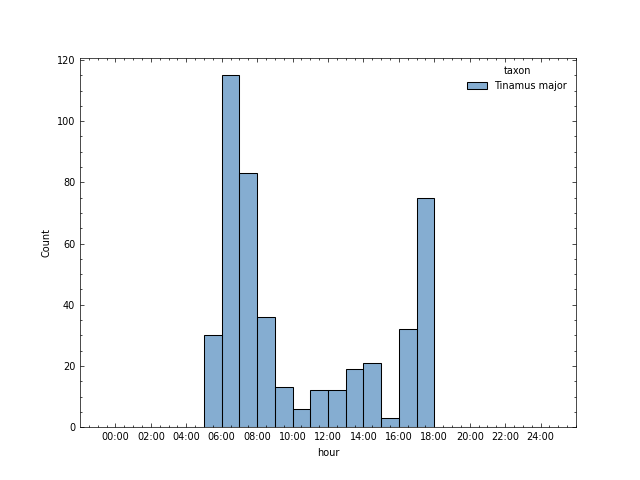
Now, let's create a histogram plot for one species:
>>> wiutils.plot_activity_hours(images, names="Tinamus major", kind="hist")
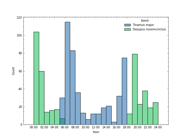
And another one for two species:
>>> wiutils.plot_activity_hours(images, names=["Tinamus major", "Dasypus novemcinctus"], kind="hist")
Similarly to the KDE plot, the histogram plot is based on the seaborn.histplot function. This means that you can pass any keyword argument accepted by that function to the hist_kws parameter.
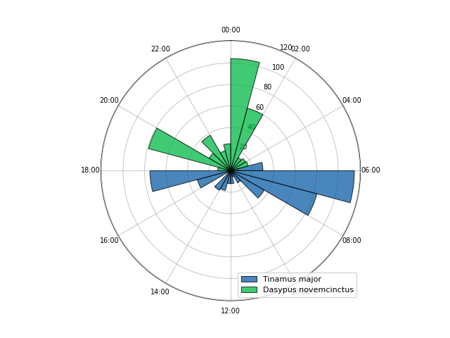
The histogram plot can also be created in circular form by passing polar=True:
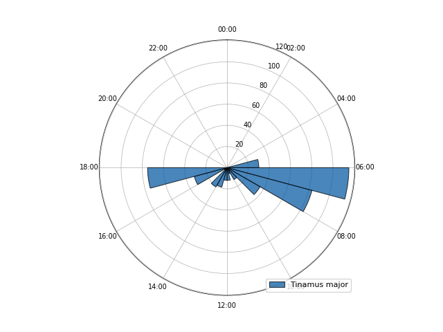
>>> wiutils.plot_activity_hours(images, names="Tinamus major", kind="hist", polar=True)
And it also works for more than one species:
>>> wiutils.plot_activity_hours(images, names=["Tinamus major", "Dasypus novemcinctus"], kind="hist", polar=True)
Note that in this case, the function is not based on any seaborn function so passing keyword arguments to the hist_kws parameter won't have any effect. There are, however, other keyword arguments that you can pass using the polar_kws parameter (see the plot_activity_hours function reference).
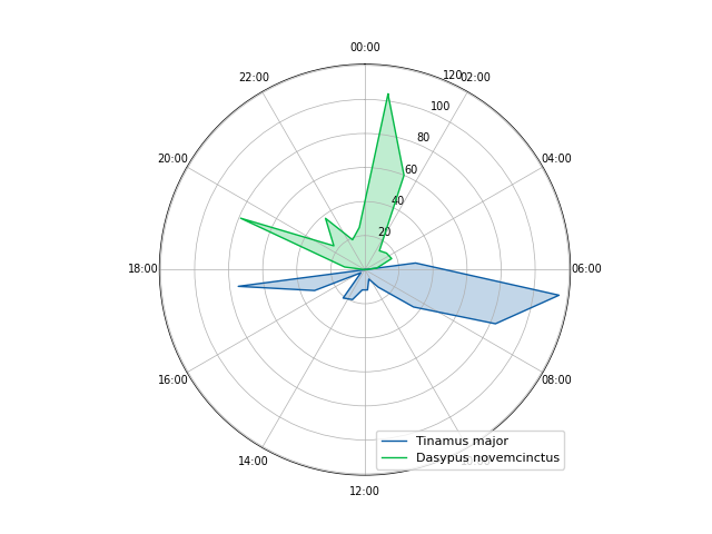
Finally, the area plot only works for circular plots:
>>> wiutils.plot_activity_hours(images, names=["Tinamus major", "Dasypus novemcinctus"], kind="area", polar=True)
Because it is a circular (or polar plot) it also accepts keyword arguments using the polar_kws parameter.
Plotting detection history
Besides being able to compute detection histories (as shown in the summarizing section), the plot_detection_history function allows you to visualize them using heatmaps.
Make sure you pass both the images and deployments dataframes, as well as a scientific name or taxon (only one item is accepted) that is present in the images dataframe.
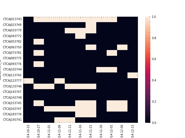
>>> wiutils.plot_detection_history(images, deployments, name="Tinamus major")
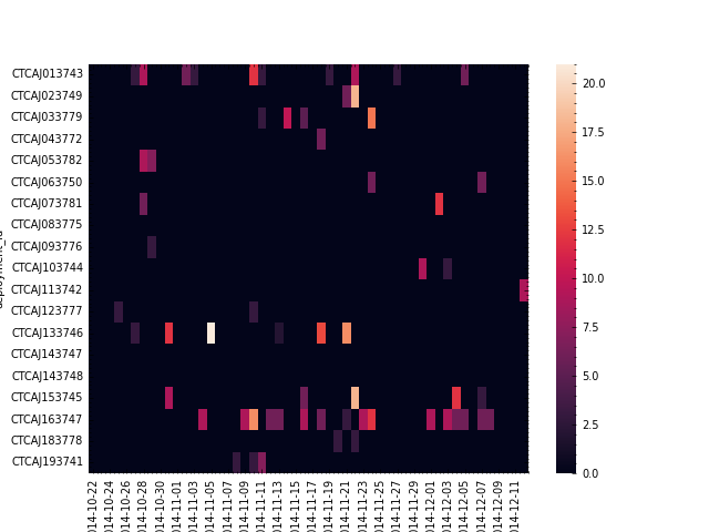
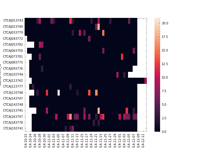
You can also pass mask=True to mask cells where the period falls outside the respective deployment date range:
>>> wiutils.plot_detection_history(images, deployments, name="Tinamus major", mask=True)
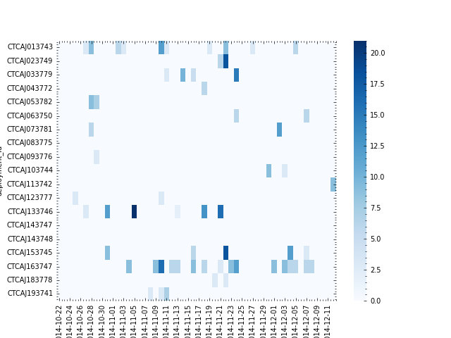
By default, detection histories are grouped in 1-day periods. Because the plot_detection_history function uses the compute_detection_history under the hood, you can pass some keyword arguments accepted by the latter using the compute_detection_history_kws parameter. For example, we can group using 5-day periods and compute presence/absence instead of abundance:
>>> wiutils.plot_detection_history(images, deployments, name="Tinamus major", compute_detection_history_kws={"days": 5, "compute_abundance": False})
The plot_detection_history function is based on the seaborn.heatmap function. This means that you can pass any keyword argument accepted by the latter using the heatmap_kws parameter. For example, we can change the default color map:
>>> wiutils.plot_detection_history(images, deployments, name="Tinamus major", heatmap_kws={"cmap": "Blues"})
Customizing plots
The plotting functions are based on seaborn functions, which is a visualization library based on matplotlib. All the functions return an Axes object which can be used to customize almost any aspect of the plot (e.g. colors, labels, axes and legend) or plot other stuff on top of the figure.
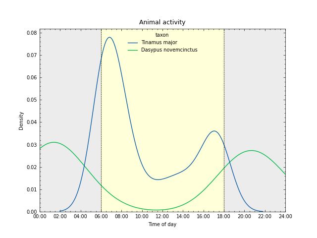
Let's take one of the plots from our examples and customize it further:
>>> ax = wiutils.plot_activity_hours(images, names=["Tinamus major", "Dasypus novemcinctus"], kind="kde")
We can modify existing axes labels and add a title:
>>> ax.set_xlabel("Time of day")
>>> ax.set_title("Animal activity", fontsize=9)
Furthermore, we can fill areas between 00:00 and 06:00 and 18:00 and 24:00 with gray and the area between 06:00 and 18:00 with yellow to simulate daylight. We can also add some vertical lines as indicators:
>>> ax.axvspan(0, 6, color="gray", alpha=0.15)
>>> ax.axvspan(18, 24, color="gray", alpha=0.15)
>>> ax.axvspan(6, 18, color="yellow", alpha=0.15)
>>> ax.axvline(6, color="black", linewidth=0.5, linestyle="--")
>>> ax.axvline(18, color="black", linewidth=0.5, linestyle="--")
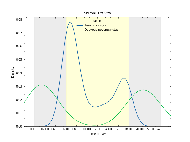
If you don't like the padding around the 00:00 and 24:00 limits, you can change the x axis limits:
>>> ax.set_xlim(0, 24)
Finally, to save a figure you can use matplotlib.pyplot:
>>> import matplotlib.pyplot as plt
>>> plt.savefig("activity_hours.png")
The matplotlib.axes documentation covers in depth all available methods that might be called on objects of this type; make sure to look it up when trying to further customize any of the plots created using wiutils plotting functions.